


Douze Points for New Way to Visualize Eurovision Data

Come closer, come closer and listen.
The beat of my heart keeps on missing.
“Listen to what,” you might reasonably ask, “and, more importantly,” you might go on, “what on earth has your heart got to do with it? Isn’t this a blog about data?”
Well, in a world-first – and, we imagine, much to the joy of 1969-era Lulu – we at Solidatus have linked the Eurovision Song Contest to the realm of data governance and regulatory compliance.
Boom bang-a-bang!
“That’s great but so what?”
It’s a fair question. The answer is that this genuinely fascinating work doesn’t just reveal otherwise hard-to-find insights into Eurovision across the ages; the upcoming song contest has provided us with an excuse to develop some models that beautifully illustrate the importance of lineage and how powerful it can be to properly map and visualize data, or rather metadata, whether for business or pleasure.
So back to Eurovision. And in a move that we’re praying won’t equally alienate its two very different target audiences – Eurovision fans and data professionals – we’ve taken a range of rich and granular datasets stretching back to Eurovision’s founding contest in 1956 and fed them into a versatile piece of software that’s more usually used by people working in complex multinational banks and other big businesses.
In this blog post, we’ll:
But first, and to whet your appetite, here are some sample Eurovision findings, upon which we expand later:
But how did we get there? Let’s first take a look at what a Solidatus model is.
Solidatus models aren’t databases and they don’t store data, or at least not the primary data you’d find in a typical database, with row upon row of similar information on names, addresses, dates of birth etc on thousands of similar records. Rather, they display metadata – data about data – through visualizations that enable users to see how data and systems relate to each other, and how data flows between them, its journey and how it impacts with other data.
In the case of Solidatus, we can meaningfully and with justification describe this metadata as ‘active metadata’, a concept you can read about in our blog post, From data to metadata to active metadata. You can read about other concepts in this field in Key concepts in data governance and managemeny: an A to not-quite-Z guide.
But lest we stray off topic, let’s take a quick look at what a model looks like.
Below is a section of a typical model, not dissimilar to those we’ve used for our Eurovision research. This one, though, was built for a more typical business use case. (We cater for many solutions and sub-solutions.)
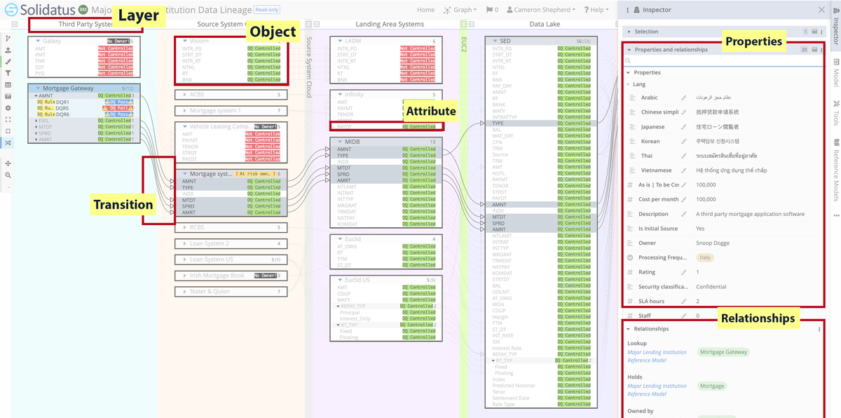
A Solidatus model comprises:
When viewing a Solidatus model, bear in mind:
And finally, a note on how this information is actually brought into Solidatus in the first place:
This is the clever bit. Models can be built manually, and there’s usually manual intervention. But we also have a series of connectors that can automate much of the process.
In the case of this project and alongside some other data repositories, we drew a lot of the info from Wikidata, the central storage area for the structured data of Wikimedia and all the many records on Eurovision it holds. And the connector we built for wider Wikipedia-related metadata ingestion and used for this project is for a query language called SPARQL.
Because here’s the thing: Solidatus doesn’t deal in data that’s unavailable to you if, crucially, you know where to look; rather, it elevates it into a more visually digestible environment, where it can be interrogated in a meaningful context.
But enough of the sales pitch. Let’s dive into the models!
By year
This model shows layers arranged by year:
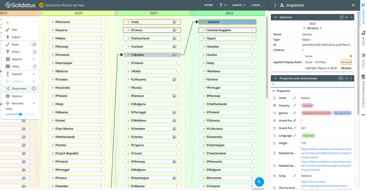
In this view, we’ve scrolled to the right of the screen so that the years 2020, 2021 and 2022 can be seen. But there’s more to the left, going back to 1956, and more below – in each layer, the countries are arranged in descending order of votes garnered.
Here, we’ve clicked on Ukraine in 2022, which shows a transition line from its position the previous year (and the one before that and so on), and changes the focus of the ‘Inspector’ on the right. This panel shows info such as:
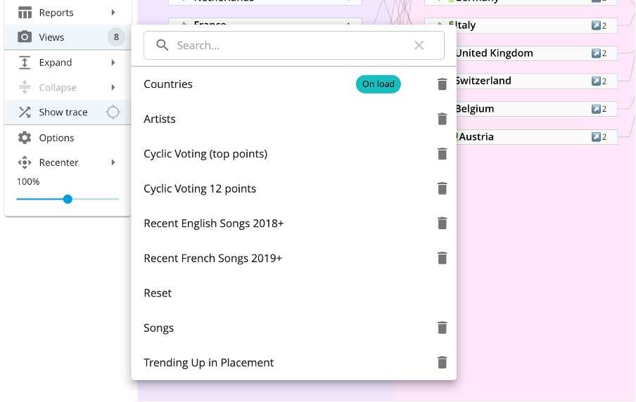
If a user clicks on ‘Views’ on the left-hand side of the screen, you can also isolate data along the lines shown below, as built by our data modeller.
Cyclic voting, based on who gave whom the top score of douze points, is an interesting one to explore, as illustrated by the transition lines here for the years 2013, 2014 and 2015:
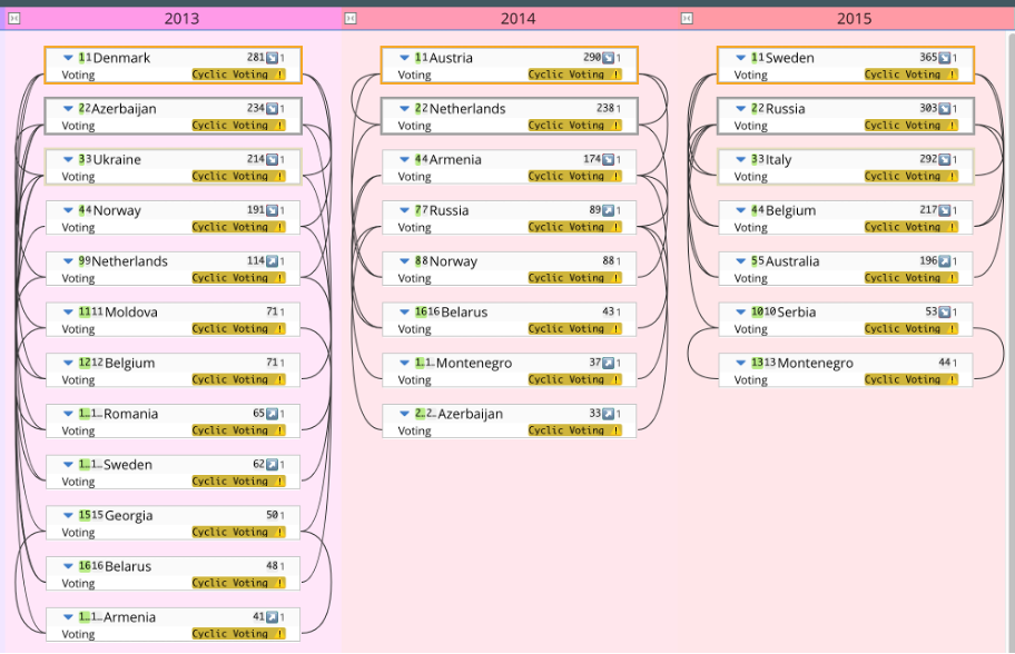
So, when you dig into the model, you can see, for example, that in 2013, Sweden’s judges awarded their two top scores to Denmark and Norway, whereas their entry received only one top score, which they got from Norway’s judges.
By country
This model shows layers arranged by country:
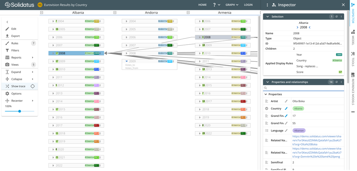
In this view, we’ve scrolled to the left, where we can see the first three countries by alphabetical order – Albania, Andorra and Armenia. By layer, each object is arranged by year, so Albania, for example, first took part in 2004.
At random, we’ve clicked on its record for 2008, the card itself showing that it came 17th that year. The transitions lines pointing into it show which countries (to the right of the model) gave it points. And in the ‘Inspector’, the usual info is available along the lines of the bullets listed in the ‘by year’ model.
‘Zemrën e lamë peng’ was its entry’s catchy title, for example.
By placement
This model shows layers arranged by placement from first to tenth:
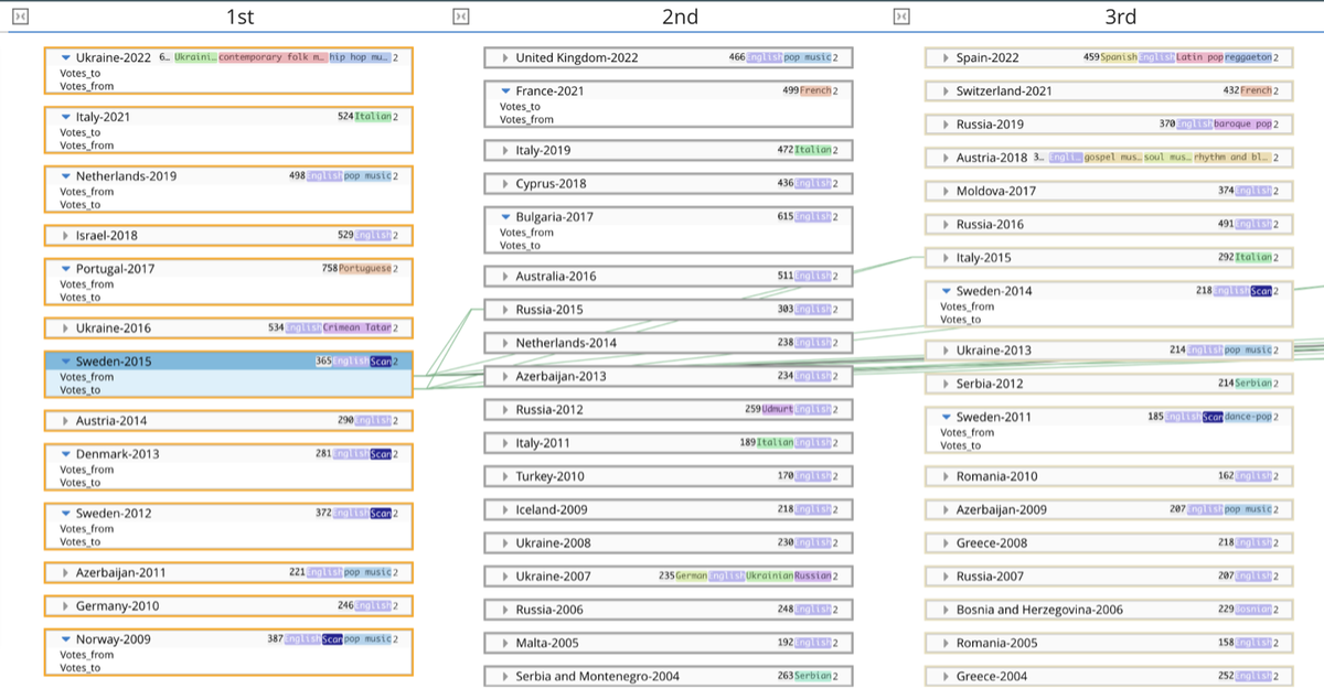
Here, we’ve clicked on Sweden’s winning entry in 2015, the transition lines showing whom Sweden gave its votes to and who voted for its winning song, Heroes, sung in English by Måns Zelmerlöw.
And the opportunities for data analysis just go on.
The point of this exercise is to illustrate the richness and granularity of this easily visualizable data, something that of course has more practical applications in the world of big business, rather than to home in on any particular stats. Nonetheless, we feel compelled to highlight a handful of key findings, which you can supplement with your own digging around.
By choosing the ‘Cyclic Voting (top points)’ view in the ‘by year’ model, we can see that pairs of countries all gave each other 12 points:
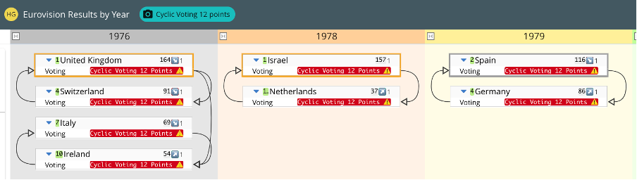
Cyclic voting in 1976, 1978 and 1979, extracted from a wider model
By exporting the ‘Inspector’ info from the ‘1st’ layer in the ‘by placement’ model, we can see that:
The United Kingdom’s sense that it has done progressively worse in recent years (last year’s second place aside) is exaggerated, given the increasing number of participating countries. The two graphics below show:
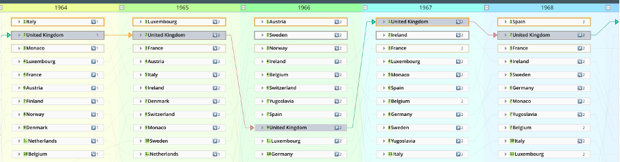
Lineage on the UK’s position from 1964 to 1968 inclusive, extracted from a wider model
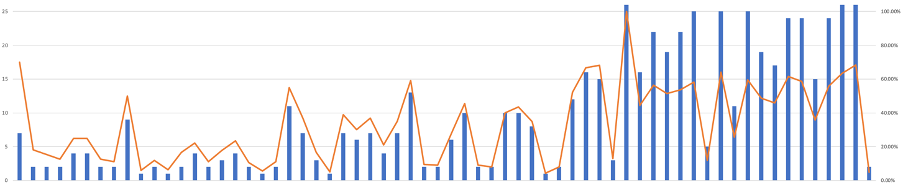
The UK’s position (blue) and percentage of countries that finished above it (orange) vs year from 1957 to 2022 (with the years it didn’t compete removed)
Now, if you’re a data professional with little interest in Eurovision, we’re grateful, frankly, that you’ve stuck with us. Maybe we’ve converted you along the way.
But let’s bring this back to the real world, or at least your world.
The beauty of a visualization tool like Solidatus is that there are virtually no limits to the applications its graph technology can be put to, all of it exploiting and promoting active metadata.
We have, though, found that Solidatus particularly lends itself to these solutions: governance and regulatory compliance; data risk and controls; data sharing; business integration; and environmental, social and governance (ESG).
We’re going to end with a quick review of governance and regulatory compliance.
Using Solidatus, you create living blueprints that map how your data flows – a.k.a. lineage – as it moves through your systems – both now and at other points in time. You can connect your data to the processes that create it, to the policies that guide it, and to the obligations that regulate it. With this framework in place, you can maintain transparency across your business, meet ever-evolving regulatory requirements, and accelerate change programs.
That’s the boilerplate. But what does it mean in practice?
Well, let’s finish with a few excerpts from our recently published case study, Solidatus models HSBC’s global lending book (PDF), this use case – alongside many others, including business integrations, and data risks and controls – being a key component of their several objectives.
In under six months, a team of two was able to document and model the global bank’s entire credit and lending book, demonstrating traceability from source to consumption. They now have a highly scalable and automated solution that is being applied to several applications from ESG to liquidity calculations and other regulatory uses.
Do read the case study (PDF) to see how they reduced a project’s cost from $5,000,000 to under $500,000, a saving of more than 90%.
And don’t let inefficient data management practices be your Waterloo.
Published on: May 10, 2023

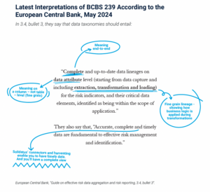
In May 2024, the ECB released its ‘Guide on effective risk data aggregation and risk reporting (RDARR)’...

Read why advanced data lineage is crucial for business success
An update on some recent developments in our latest product releases
Read more about data lineage and its business impact, including on AI, BCBS 239 and more

Navigate BCBS 239’s rigorous standards with advanced data lineage
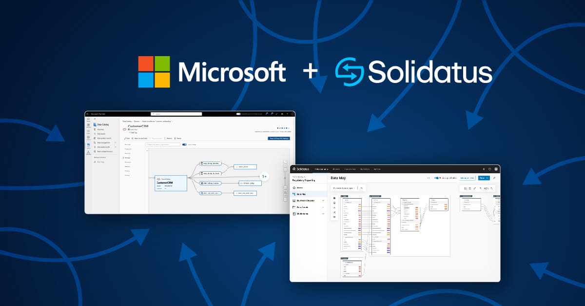
Solidatus data lineage partners with Microsoft Purview to help enterprises trust their data

Read about the new Solidatus interface

Read our key takeaways from Gartner D&A Summit 2024

Video introducing our new interface and core features like Connected Catalog and Data Map

Read about Solidatus and Snowflake Horizon's governance solution

Explore the various aspects of data lineage and its crucial role in your organization.

Basel III is changing – are you prepared? Read 3 easy steps with Solidatus
Read how we helped successfully launched the Houston Women in Data Chapter

Exploring the parallels between urban planning and data planning projects

71% of senior data leaders in financial services polled are close to quitting their jobs

Take a look at what's new in our partnership with Snowflake

VP Product, Tina Chace, reflects on the Gartner conference, covering data governance and AI

In the latest Gartner® research note, find out what active metadata is

The role of metadata, dynamic visualization and inference across metadata

Automatic connectors are essential for efficiently mapping metadata but not all are created equal. We look at the most important...

We discuss injecting active metadata into your governance and 4 other things we’re looking forward to at the Gartner® Data...

Subscribe for the latest news, blogs, and resources.